 |
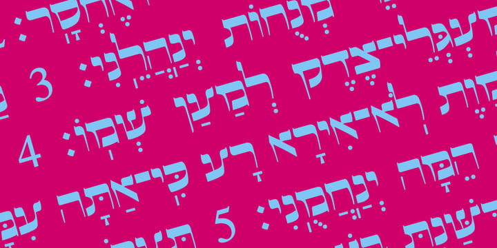
This is beautiful script font based in typeface of the Pirkei Avot book.
 |
This is beautiful script font based in typeface of the Pirkei Avot book.
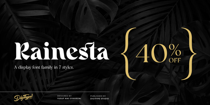 |
Rainesta comes with 7 unique font styles, you can use them according to your project, whether for headlines or taglines. This font is very suitable to be applied to various other formal forms such as websites, ebooks, labels, logos, magazines, books, packaging, fashion, make-up, stationery, labels, or all kinds of advertising purposes.
Features:
7 styles
uppercase & lowercase
numbers and punctuation
multilingual
ligatures
PUA encoded
Thank you.
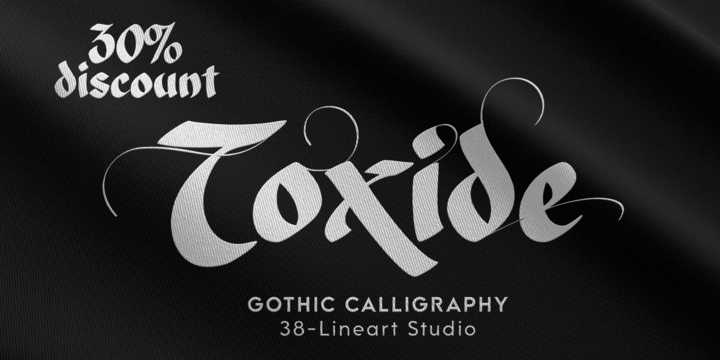 |
"Toxide" is a gothic font inspired by Celtic and uncial style. We give a unique touch so that this display font is very suitable for brands, logotypes, headlines, badges, video titles as well as for book and magazine covers.
This font supports Latin diacritic for basic glyph along with its 7 stylistic sets. A total of 1193 glyphs give you the flexibility to choose the right glyph in your design.
Please enjoy and have fun with the stylistic set game that you like while you feel the classic feel in a modern design
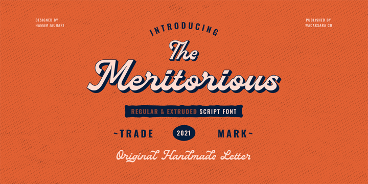 |
meritorious is a script font with a bold vintage style. come with two versions (regular and extruded).
This font is inspired by the manual lettering style that is suitable for your design needs such as book cover, logotype, branding, letterhead, poster, product packaging, label, invitation, and more.
meritorious comes with uppercase, lowercase, numbers, punctuation and there are variations on each character including OpenType alternatives, common ligatures.
Thanks
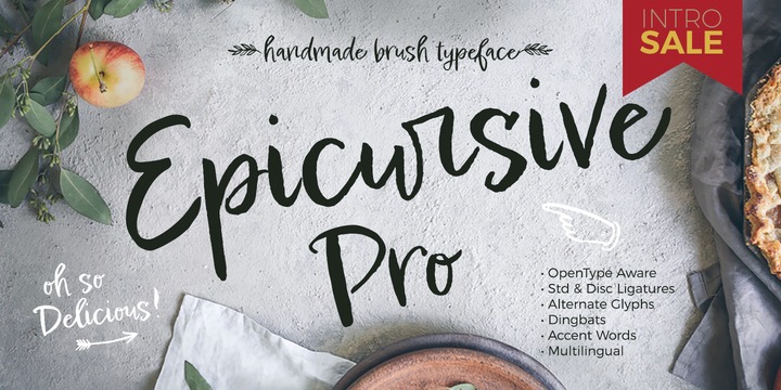 |
Epicursive Pro is handpainted with lots of personality and good vibes. This typeface comes with of great dingbats to accentuate your words and embellish your logos. It looks marvelous over photos and is a charmer with illustrations. Perfect for Food and Fashion, Editorials, Book covers, Posters and Branding projects as well as Stationery & Giftware.
Employing OpenType magic, it includes Standard Ligatures, Discretionary Ligatures and healthy collection of Alternate Glyphs to customize your text.
¿Habla Espanol? No problema, Epicursive Pro supports all European languages.
 |
Grah ia a friendly display handwritten font with unique dan natural style It will add a joyful touch to each of your projects.
Featured:
- Uppercase and Lowercase
- Number and punctuation
- Multilanguage Support
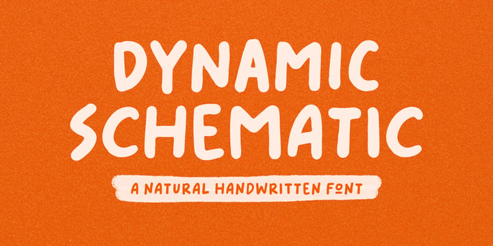 |
Dynamic Schematic is a natural handwritten font, written with fun and relaxed. It comes with 400+ glyphs, which also include multilingual languages.
Dynamic Schematic is perfect for headlines, branding, quotes, and many more.
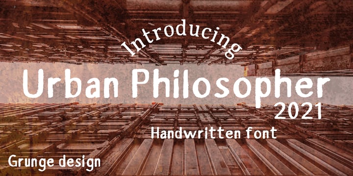 |
Urban Philosopher is a experimental font, its kind of mix of vintage typography with 80 s grunge.
The font have a little messy and dirty texture, which gives it a little "horror" effect.
The font includes almost all letters of the Latin alphabet.
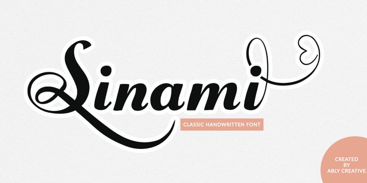 |
Sinami is a chic handwritten font. The authentic texture makes it a perfect choice. It has a bold classic calligraphy look making it perfect for branding and digital designs, logos, invitations, business cards, web, Instagram, social media, quotes, prints, wall decor, Branding projects, and more!
Whats you get:
Works on PC & Mac
Simple installations
Supports multilingual
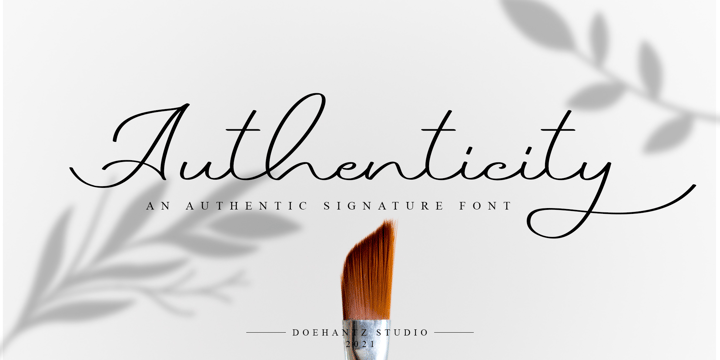 |
Authenticity is an authentic signature font. It made with a neat touch making it easy to read. This font is suitable for use as web logos, signatures, invitation, prints, headers, magazines, book covers, t-shirt prints, craft, product brand, business card, logo, and gift card
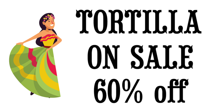 |
Tortilla is a flat sided version of our Saloon Girl and Tex Mex font families.
When you want a smooth classic western font without spurs in the letters Tortilla is just right.
Whether you're making a new Mexican restaurant menu or a new logo for your cowboy boot and hat company Tortilla is the font you're looking for.
If you're a pioneer in the culinary scene Tortilla is perfect for your next cookbook cover, chili cook off or barbecue competition.
Just like our Saloon Girl and Tex Mex fonts Tortilla also has the option to work in layers using the fill fonts, to make a layered font image you'll need an application that works in layers such as Illustrator or Photoshop.
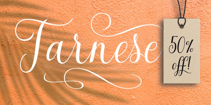 |
Tarnese is a calligraphic font, created to look as close to a natural handwritten script as possible. Tarnese includes over 60 natural-looking open-type ligatures and and a full set of upper and lowercase alternates, making your design more attractive. In the glyph palette you will also find ornaments that can be used for underlining, and to combine and enhance your text.
Suitable for use in designing titles, invitations, title books, stationery designs, quotes, branding, logos, greeting cards, packaging, posters, and more.
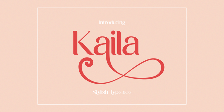 |
Kaila is a bold but elegant serif font. Its elegance and simplicity make this font look absolutely stunning on a variety of design ideas, both formal and informal.
 |
Kaila is a bold but elegant serif font. Its elegance and simplicity make this font look absolutely stunning on a variety of design ideas, both formal and informal.
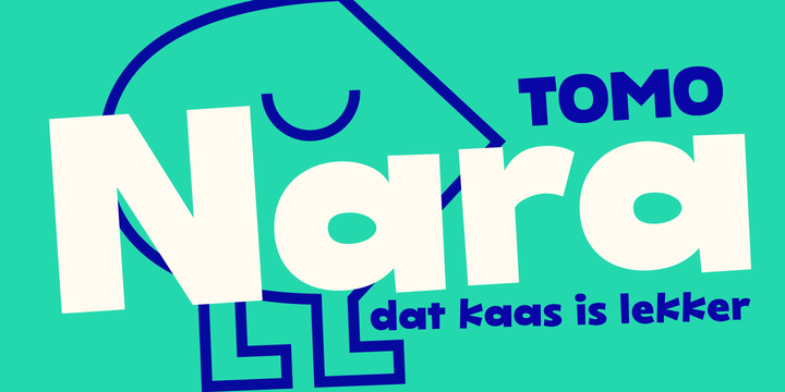 |
TOMO Nara adds plenty of joy to any logo, layout or UI. Geometric shapes and a funny look come together in this font – thus, Nara might be the perfect choice for toys, books, packaging, posters or even webapps! Let’s have some fun!
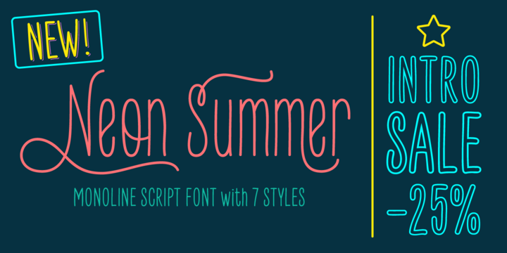 |
Neon Summer is a monoline script font: modern, warm, fun and lovely. It's a family of 7 styles, some of which are layerable and ready to play with! This typeface offers opentype features such as ligatures, alternates, swashes, and multilingual support with over 500 glyphs.
With all of these features and options, it makes a good choice for a more modern, yet warmer and funnier aproach in texts, display, posters, book covers, quotes, branding, social media, packaging and more...
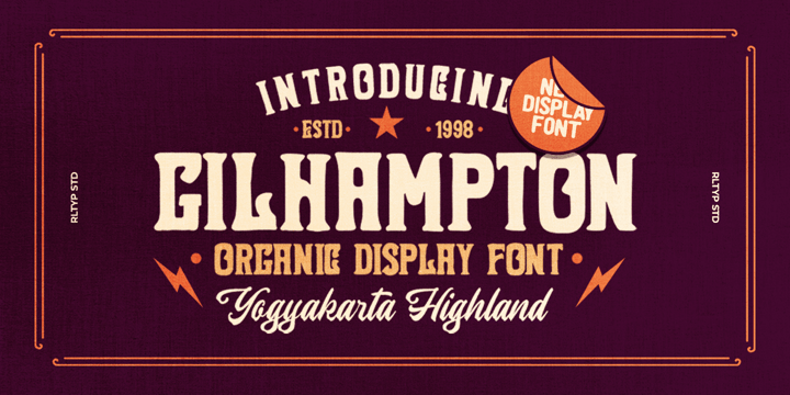
Introducing, Gilhampton organic typeface!
Gilhampton is an organic display font that have an organic and quirky characteristic that makes this font looks natural and hand drawn. this font is perfect for people who are looking for design with organic touch. this font is suitable for branding, packaging, headline, quotes, etc.
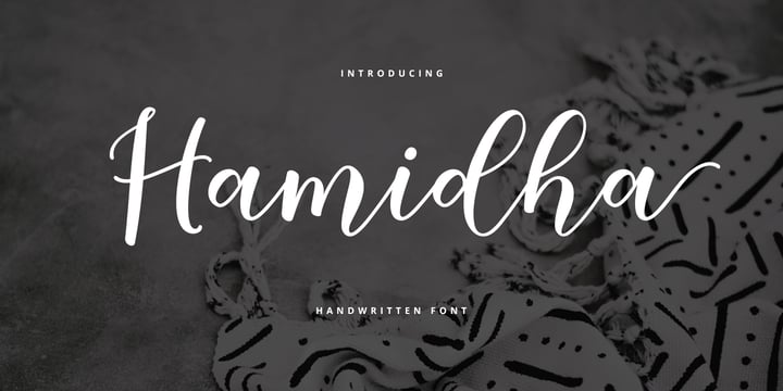
Hamidha is suitable use for market design developed at this time, this font has a model Trendy, natural and gentle, with this font you can take advantage of the opportunity in every moment of one wonderful way to highlight the celebration of the feast of your best, because this font will be advocates for purposes such as wedding invitations, party, graduation, birthday, gathering, etc.
you need a program that supports Adobe Illustrator CS, Adobe Indesign & CorelDraw X6-X7, Microsoft Word 2010 or a later version.
How to access all alternative characters using Adobe Illustrator:
https://www.youtube.com/watch?v=XzwjMkbB-wQ
Hamidha is coded with PUA Unicode, which allows full access to all additional characters without having to design any special software. Mac users can use Font Book, and Windows users can use Character Map to view and copy any additional characters for pasting into your favorite text editor / application.
How to access all alternative characters, using the Windows Character Map with Photoshop:
https://www.youtube.com/watch?v=Go9vacoYmBw
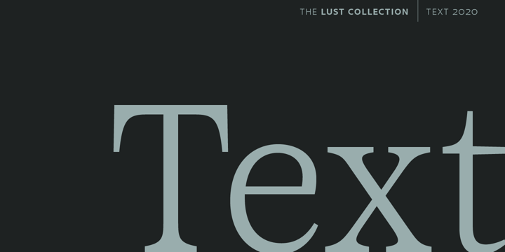 |
Yes, finally. This one took the most time and the most restarting. Years went into imagining what Lust Text should look like and how it should structurally behave in order to truly improve upon a setting that includes any of the Lust typefaces. I approached it as much from the side of the type designer, as I did a potential user. The flow, the warmth, the personality needed to be there, but all of the excess had to be removed responsibly. In the process, and in need of inspiration, I looked backward to historical artifacts and precedent. In each early Lust Text approach, the solution was lackluster and/or vanilla and not actually a ‘Lust’ typeface. The exercise was not in vain though. By exploring past examples, I found my footing drawing for media now and how it might be used later—all the while, producing seamless, elegant curves and restrained indulgence (that sounds almost silly to say, but I like it).
The Lust Collection is the culmination of 5 years of exploration and development, and I am very excited to share it with everyone. When the original Lust was first conceived in 2010 and released a year and half later, I had planned for a Script and a Sans to accompany it. The Script was released about a year later, but I paused the Sans. The primary reason was the amount of feedback and requests I was receiving for alternate versions, expansions, and ‘hey, have you considered making?’ and so on. I listen to my customers and what they are needing… and besides, I was stalling with the Sans. Like Optima and other earlier high-contrast sans, they are difficult to deliver responsibly without suffering from ill-conceived excess or timidity. The new Lust Collection aggregates all of that past customer feedback and distills it into 6 separate families, each adhering to the original Lust precept of exercises in indulgence and each based in large part on the original 2010 exemplars produced for Lust. I just hate that it took so long to deliver, but better right, than rushed, I imagine.

We present Woop a creative magazine templates for bloggers who love to blog on food, fashion, travel and for personal blog.
Enter your email address below to subscribe to our newsletter.